
Aros default GUI improvement proposal
Aros default GUI improvement proposal
I'm an Aros enthusiast and I follow the development progress on arosworld. Recently, a x64 development build was shared in a Deadwood thread, so I decided to test it.
After all, building a virtual machine with VMWare Workstation Player is child's play.
So I downloaded the build, launched VMWare, and quickly found myself in the Aros desktop.
At this point, as an end user accustomed to Windows 11, I had difficulty understanding the system because:
- There's no taskbar at the bottom with the main applications
- Searching for applications requires navigating through countless open windows
After several attempts, I understood the interface somewhat, but I wanted to test the system:
- Opening an image
- Watching a video
- Listening to a song
- Browsing the Internet
And here's where the problems arise: a complex, inconsistent, and unintuitive interface.
This article is intended to be a constructive starting point for improving the system.
INTRODUCTION
Aros is an Amiga-like system derived from AmigaOS 3.1 for former Amiga enthusiasts and, why not, for newcomers discovering the system as an alternative thanks to the ARM or x64 platforms.
There are still m68k-compatible versions, which are much slower and older systems.
GENERAL
When right-clicking in Windows, I was used to seeing the object's properties, but here I had to change my habits.
It's still a different way of working, but I think the Windows one is better and more intelligent.
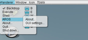
However, one of the problems with right-clicking and seeing the main menu is the excessive "about" content in the menu. I think the information and about content should be unified in the system information.
Every time you change an option, you need to reboot the system for it to take effect. No big deal, rebooting is very quick.
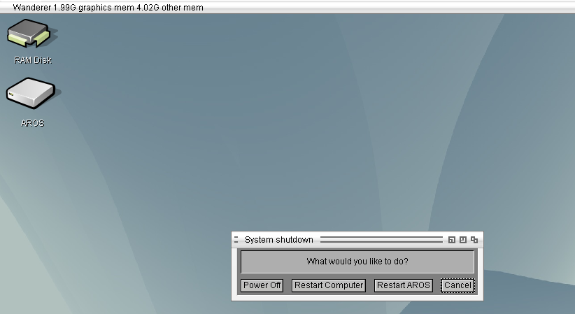
But when there are too many restart options...
- Quit, shutdown, restart, restart aros? too much
GRAPHICAL INTERFACE
The default theme is called "ice," and I find it ineffective, so I went into the preferences and found other themes, including "Arosdefault."
The arosdefault theme isn't the default, and it seemed strange to me.
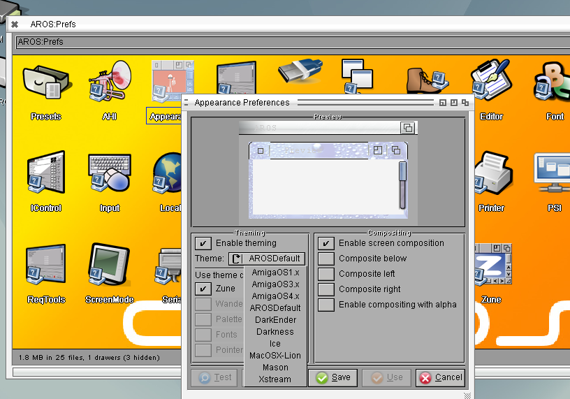
Anyway, considering the premises, I think the base theme should be inspired by amigaos3.1.
In my opinion, two would be needed:
an arosbaselight: a lightweight theme dedicated to the m68k, without gradients or effects for slower systems.
an arosbaseplug: a theme for higher-performance platforms, more modern but still inspired by amigaos 3. Maybe the same blue but with a gradient, a larger title bar, a ttf font, etc.
Distros can customize with advanced features, but the base theme must already be understandable.
The icons aren't exactly "amiga"—I prefer the AmigaOS 4 ones to look at—but for the Aros system, there are many collections to choose from, and I think a working group could be started here.
A decent taskbar is needed, and I've seen some nice ones around. I'd involve the community in choosing the default one.
PREFERENCES
In the preferences section, a new user can be a bit confused by the acronyms used and by the overlapping preferences.
For example, wouldn't it be better to have a single "look" instead of three preferences: "Appearance, Wanderer, Zune"? Have everything in the same place?
Wouldn't it be possible to rename ahi->audio, trident->usb, icontrol??, PSI??
TOOLS
Here too, a novice user has difficulty: Quickpart and hdtoolbox. Why two tools? Why use one over the other?
USABILITY
- I haven't been able to find a browser for what has become a fundamental application.
- I haven't been able to find a way to download and install applications.
As soon as you install Haiku, there's a user guide and manual on the desktop. Could the same be done in HTML format, perhaps hosted on aros.org?
arosbeginner 08/28/2026 282 reads
1 rating
Print