Oh no! Where's the JavaScript?
Your Web browser does not have JavaScript enabled or does not support JavaScript. Please enable JavaScript on your Web browser to properly view this Web site, or upgrade to a Web browser that does support JavaScript.

Aros default UI improvement: 3 - Kens Icons as default icons set

Last updated on 11 hours ago

Poll: Are you in favor of adopting the "kens icons" icon set as the default icon set for aros?

    Yes [0/3]0 %
    No (If no please comment) [3/3]100 %
    Indifferent [0/3]0 %
A
arosbeginnerJunior Member
Posted 15 hours ago
After
the first article (https://www.arosworld.org/infusions/articles/articles.php?article_id=3)
first proposal (https://www.arosworld.org/infusions/forum/viewthread.php?thread_id=2063&pid=13971#post_13971)
second proposal (https://www.arosworld.org/infusions/forum/viewthread.php?thread_id=2064&pid=14065)

The third improvement proposal concerns the icon set.
I don't want to revisit issues the community has had in the past.

https://www.aros.org/documentation/faq.html#why-dont-the-nightly-builds-use-nice-themes


Quote

Why dont the nightly builds use "nice" themes?
The problem is that "nice" is subjective. There is no default theme that will satisfy everyone, and changing the upstream default whenever somebody dislikes it just turns aesthetics into an endless cycle of "change it back."

That's why the distinction between AROS itself and individual distributions matters. Distribution maintainers are free to decide how their particular distribution looks and what defaults it ships with.

The nightly builds aren't intended to be a polished, opinionated desktop product; they're a consistent environment for development and testing. If you prefer a different look, customise it or build a distribution around that preference.

Personal preference is a perfectly legitimate reason to customise your own system, but it's not a particularly good basis for changing the upstream project's defaults.


So, if there were a volunteer developing a new icon set just for Aros, they would be welcome. But since they don't exist, I'm proposing the solution that provides the greatest benefit with the least effort.

I understand that everyone has personal tastes and requests, but this involves improving the default Aros graphics when downloaded from the Aros website, which are downloaded by many new users, such as Raspberry Pi users.

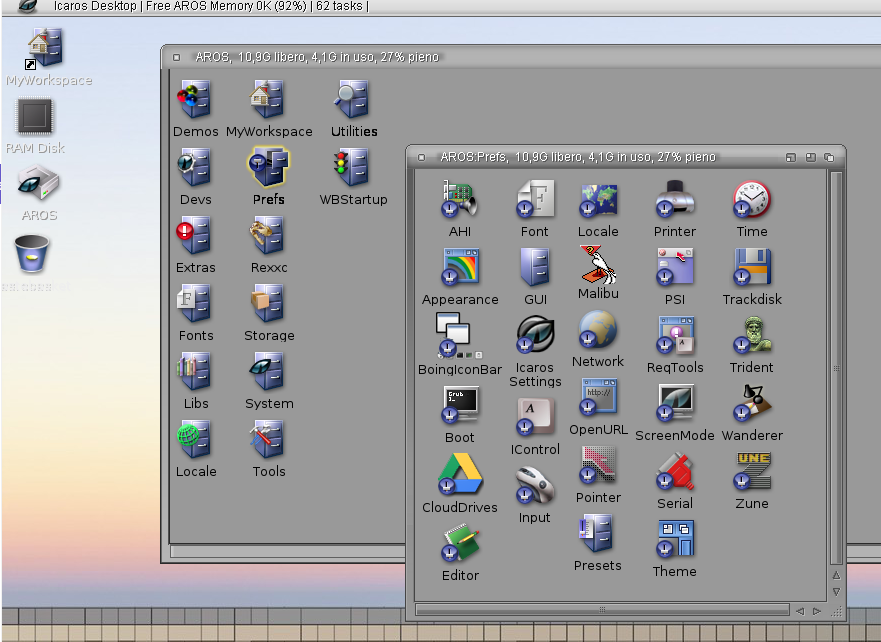
Therefore, the proposal is to adopt the "kens icon set", which is already available. It's clean, customized, and has enough icons to cover all needs.
https://www.amiga-look.org/artwork/kens-icons-v23

i.postimg.cc/HLM8gRhn/icaros-desktop2.png


Furthermore, over time, many Aros distribution developers have expanded the set with new icons, so it could be a common basis to work from.
aha, coffeecat
olivier2222
N
ncafferkeyAROS Dev
Posted 12 hours ago
The last time I checked, distribution of Ken's icons wasn't allowed. They were used in Icaros Desktop by special permission IIRC. However, if things have changed, I'm open to correction.
M
miker1264Software Dev
Posted 12 hours ago
As for Ken's v4 icons I have permission to use them, modify them, make new ones & distribute. I've posted several packages of them on AROS archives.

That's the reason behind my Icon Builder program. It's based on making Ken's v4 style icons.

Not sure if this permission applies to AROS in general or just these icons. Not sure if that permission extends to maintaining a distro & distributing icons that way. Although if I make an entire icon set in Ken's v4 style they are essentially my icons that I made. But to be fair I would ask permission to maintain a distro with those icons just to be honest. But they look nice!

I especially like the charcoal black icons with neon blue glow that I'd like to include in a "Dark Theme" that would be nice! But gold glow works!
Edited by miker1264 on 03-09-2026 13:10, 11 hours ago
You do not have access to view attachments
AMIGASYSTEMAMIGASYSTEMDistro Maintainer
Posted 11 hours ago
The Ken v4-style icons are very beautiful, but they belong to the past—in fact, many users are attached to these icons purely out of nostalgia.

As I’ve said before, AROS must be innovative and appealing. A user unfamiliar with AROS who sees the Ken v4-style icons might think they’re looking at a system from 30 years ago.

If we want AROS to grow, we need to break with the past and be innovative.

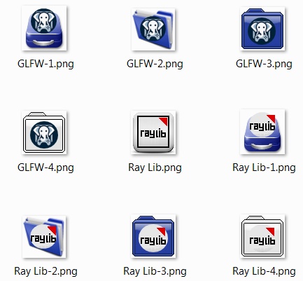
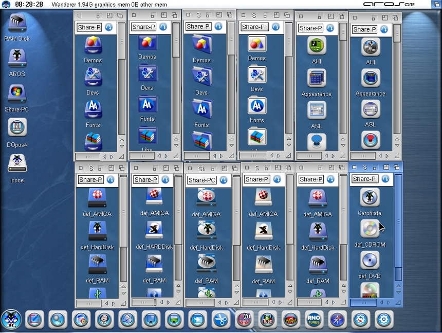
Some people have called the AROS One icons “old,” and coincidentally, many of the mobile phone icons resemble the AROS One icons, which I created more than 10 years ago on AfA One.

In the early versions of AROS One, I created four sets of icons, but no one was interested in them because many people are still attached to the past and to Amiga icons.


www.arosworld.org/infusions/forum/attachments/icons_1.jpg


www.arosworld.org/infusions/forum/attachments/icons.jpg
M
miker1264Software Dev
Posted 11 hours ago
AROS One Icons look very nice too! I actually like your earlier icons better. They have a Faenza look to them. :-)

Rather then get into a discussion about which are nicer or more appealing it would be better to have a quick easy way to replace icons, window styles and backgrounds.

The upcoming Amiga OS 3.3 is believed to have a program called "Icon Assist". Maybe we could have something like that. Icon Replacer.
Edited by miker1264 on 03-09-2026 13:35, 11 hours ago
You can view all discussion threads in this forum.
You cannot start a new discussion thread in this forum.
You cannot reply in this discussion thread.
You cannot edit the poll in this discussion thread.
You cannot vote on the poll in this discussion thread.
You cannot upload attachments in this forum.
You cannot download attachments in this forum.
Users who participated in discussion: AMIGASYSTEM, miker1264, arosbeginner, ncafferkey